PREVIEW: Tim Doyle “Unreal Estate” Solo Exhibit @ Spoke-Art [SF]
for his 1st ever solo exhibit, Tim Doyle explores the fictional locales from classic TV shows, from Sesame St. & The Simpsons to Seinfeld & Arrested Development
It’s been a good 3 years since we first heard the name Tim Doyle. After catching a glimpse of his “Bill Murray Times Six” print, which quickly sold out through Doyle‘s own Nakatomi Inc., it was pretty clear that the Austin-based designer was definitely someone that we’d be hearing from again. In September of 2010, we were contacted by the R&R Gallery in L.A. about a Bill Murray themed exhibit they had in the works and the first thing that I thought about was how I’d already seen Doyle nail the subject over a year and a half prior. I noticed that he didn’t seem to be a part of the group exhibit and decided to hunt down what he had been up to. To my pleasant surprise, I came across another Murray-related print, but this time it was Rushmore-inspired. Along with the image was the information that it was created for a new Wes Anderson-themed exhibit. The show was titled “Bad Dads” and was being curated by a fledgeling new gallery/publishing house known as Spoke-Art.
The Bad Dads show was wildly successful and the 3rd installment of the trademark exhibit is scheduled to take place later this year. With the aid of consistently impressive themed group exhibits, such as the Quentin VS Coen series, Spoke-Art has continued to establish themselves as one of the top underground contemporary/pop-art galleries on the West Coast. Not only has Timothy Doyle been along for the ride but, with his -typically multiple- contributions to these shows, he’s remained one of the major contributing factors to Spoke-Art‘s success. Nakatomi has found continued success in it’s own right and Doyle‘s art has continued to pop-up in such places as Gallery 1988 and on poster work for the infamous Alamo Drafthouse. Still, for whatever reason, we’ve yet to really see Tim shine in a full-on show of his own. Now, as with Serge Gay Jr. before him, Spoke-Art is honoring one of the artists who’ve helped them to become what they are today, by playing host to Tim Doyle‘s very first solo art exhibit.
For “Unreal Estate“, the printmaker has chosen to direct his focus towards the many destinations and landmarks that we, as a television viewing society, have only ever been able to visit on the small screen. By doing so and providing a more “realistic” take on many of these environments (Sesame St., Arlen Texas, Springfield… somewhere), an unspoken conversation is created about where the lines of reality and personal truth truly begin and end. Is the relation to and histories that we have with these pseudo-fictional locations any less authentic than the ones that we visit or pass through without any personal attachment or acknowledgement in our every day lives, or could they be even more authentic than any of them? By creating art that imitates reality, when the reality that’s being imitated is art and the imitation is more reality-based, it not only makes for me typing this ridiculously confusing sentence that you’re currently reading, but it also provides the potential for Doyle‘s solo exhibit to turn the magnifying glass back on pop-culture and plead a case for it’s continued relevancy as a muse in the contemporary art world. More than just an excuse to do something like paint cool pictures of action figures, “Unreal Estate” reminds us that, regardless of how much corporate marketing or product branding lifts their metaphorical legs to drip their pungent territorial markings over every square inch of our living environments, something tangible and meaningful can permeate through the cracks and become very dear to our identities as individuals, even forming bonds on a communal level. In the end, whether it’s intentional or not might not even matter.
ADMISSION IS FREE!
Here’s the lowdown…
DETAILS:
What:
Tim Doyle’s “Unreal Estate”
When:
Thursday February 2nd 6pm-10pm (opening night)
Where:
Spoke Art Gallery –
816 Sutter Street, San Francisco CA 94109
Website:
http://www.spoke-art.com
Show will be on view through Thursday February 23, 2012
As an added bonus, the artist will be in attendance for the opening and we are happy to announce that the first 100 guests will receive a complimentary limited edition screen print.
RSVP here – http://www.facebook.com/events/233654490049532/
From my own personal experience, artist statements have historically been “the worst.” Far too often, they seem to be nothing more than an opportunity for someone to try to convince you of their greatness and relevance that, if authentic, should already be obvious in their work. Contrived little write-ups, they offer a forum for some pretentious goon to explain how they are providing you with perspectives that come deep from within their haunted souls; perspectives that are unique to them as extraordinary beings. Perspectives that are important to the world and perspectives that you could have never witnessed or experienced without them. Rarely passionate, they instead focus on ideas of passion and result in little more than far-reaching claims and pleas for acknowledgement. Generally, I hate artist statements, because it’s far too rare that I actually feel that the artist is trying to actually connect with the reader and it’s far too rare that you can actually sense their passion or reason for creating anything. It’s about talking over your head. It’s about a need for a pat on the back and not passion for the topic or subject matter, but for their own egos. The following artist statement shatters that mold and, because it reads as genuine, honest, and unpretentious, we’ve chosen to go ahead and post it this time and allow Tim Doyle to tell his own story about what the exhibit is all about.
Artist Statement
“Unreal Estate” by Tim Doyle
Last June, after the opening reception to the Quentin versus Coen show in San Francisco, the founder of Spoke Art, Ken Harman, invited me to have a solo show at his gallery later that year. I was immediately flattered- and then the fear set in. If it’s just me, not only was I looking at months of work in secret- but the success or failure of the Gallery that month was up to my ability to create and be clever.
I initially was going to do a very diverse show with a bunch of unconnected works, essentially throwing the visual parts of my brain up on the wall and hoping people liked what they saw. But after talking to Ken for a while, he seized on a couple of ideas I had and did what a good gallery owner should do- focus his artist. This is the show that came of that.
“Unreal Estate” is a collection of locations that many of us know and have been to on a weekly basis at times, but we can never actually visit. These places are in our memories- transmitted and entrenched there through a cathode-ray tube. Some of us have been going to these places for decades- some of these places were taken from us, way too soon..
It’s weird to think about a pop-art solo exhibition as an intensely personal show, but I’ll do my best to explain it here. Over the summer as I was preparing for this show, I did some research on “All In the Family” (a print I hope to get to in the future) and how the exterior shot of the house was a real place given the fictional address of 704 Hauser St, in Queens. Surprisingly- in the early 90’s, “All In the Family” creator Norman Lear had a show called “704 Hauser” featuring a new family living in the same house, occupying the same fictional location. Reading about that was an odd revelation to me. See- I always felt like “All in the Family” was like a televised echo of my maternal Grandparents in a way- an East coast blue collar family living in a row-home, a loveable but gruff father figure, a loving if slightly crazed mother- all dealing with a world that was changing rapidly around them. It’s not a perfect fit, but the themes were there- the show FELT like a visit to my Grandparents, if that makes sense. Last Summer I had driven by their old house in Delaware for the first time since my Grandfather’s funeral in 2001-ten years had passed, and it was a heady mix of emotions seeing the house still there, but now occupied by strangers.
Also, that summer I read the news that “The Simpsons” might be ending over a labor dispute, and found myself strangely affected by that probability. (I sided with the talent, obviously.) I had been there in the late 80’s watching their proto-versions on The Tracy Ullman Show and when they finally got their own program, my family and I made our weekly pilgrimage to Springfield.
The thought that the show might be leaving us, considering that I had spent more of my life watching Simpsons than NOT at this point, was a big deal. I thought of Springfield’s more famous locations- how all of us (in the western world, at least) know where to get a Squishy, grab a Flaming Moe, or remember when Jebediah Springfield lost his head. And I realized these completely fictional physical landmarks of television shows are a kind of cultural geography. A shared mental construct that we all participate in- and like actual buildings they will one day be torn down, their time-slots paved over, or we will maybe find new people living in those exact same addresses.
So this was the ooze of pop-culture and melancholy that I had kicking around in my head when I dove into this art show. Artistically, I wanted to move away from what my audience would normally expect from me- big bold colors and a comic-book line quality. I wanted to do these pieces in a more brushy, illustrative style, with more muted tones and colors that reflect a mood or time of day. My tried and true 4-color pop of past prints like ‘The King of Crabs‘ was going to have to take a back seat while I try something newish. I wanted these to look more like my Ghostbusters “Ready to Believe You” or the American Werewolf in London “Stay off the Moors” prints did. It was a style I really like working in, but is definitely more time consuming than my normal deadlines allow. The lead in time I had for this show afforded me the luxury to experiment more with my style.

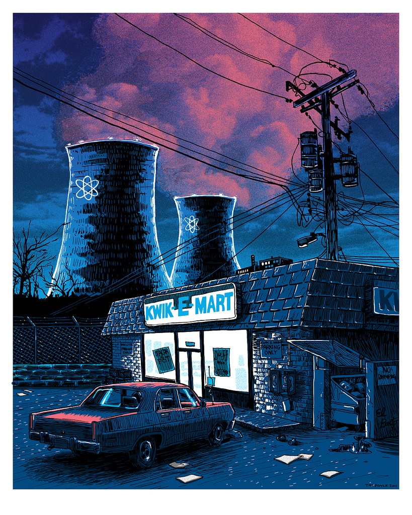
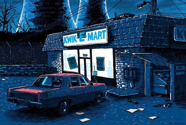
“Night over the SNPP”
16×20, Signed and numbered edition of 100.
The first three prints I created for the show were all inspired by The Simpsons- I knew I had to kick them out of my head up front and move on, as The Simpsons could very easily dominate the entire exhibit if I let it. I purposefully set these three images at night or sunset to force the color scheme away from the pastel and neon palette of the show.
I remember my Dallas-suburb Middle School placing a ban on Simpsons t-shirts in the late 80’s, as the show was considered a bad influence, and Bart an animated public-enemy #1. Now, the show is an American monument- a purple and green and yellow Mt. Rushmore in time and celluloid. The Simpsons is probably one of our most enduring exports- it’d be hard to go to a country on the globe where the characters aren’t recognized. Even in 1992 my young mind knew how out of touch the then-campaigning George Bush Sr. was when he said that Americans “…needed to be closer to the Waltons than the Simpsons.” He lost that election to the more media savvy Bill Clinton- pop culture affecting Presidential politics. Mr. Plow predating Joe the Plumber.
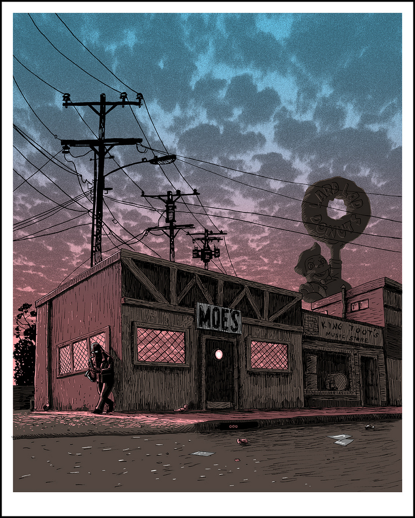
“Amanda Hugginkiss”
16×20. Signed and numbered edition of 100.
This one is my favorite of the bunch- the blue to pink split fountain echoing the setting sun.
The problem with starting a series like this is that you might write up a list of all the pieces you want to do, but once you’ve got a few images in, you’ve already thought of a whole list of brand new images you want to do first and the original ‘sacred cows’ you wanted to hit get bumped further and further down. (All In the Family is a casualty of this process.) This two part print of America’s favorite street is one of the ones that popped up and refused to wait it’s turn.
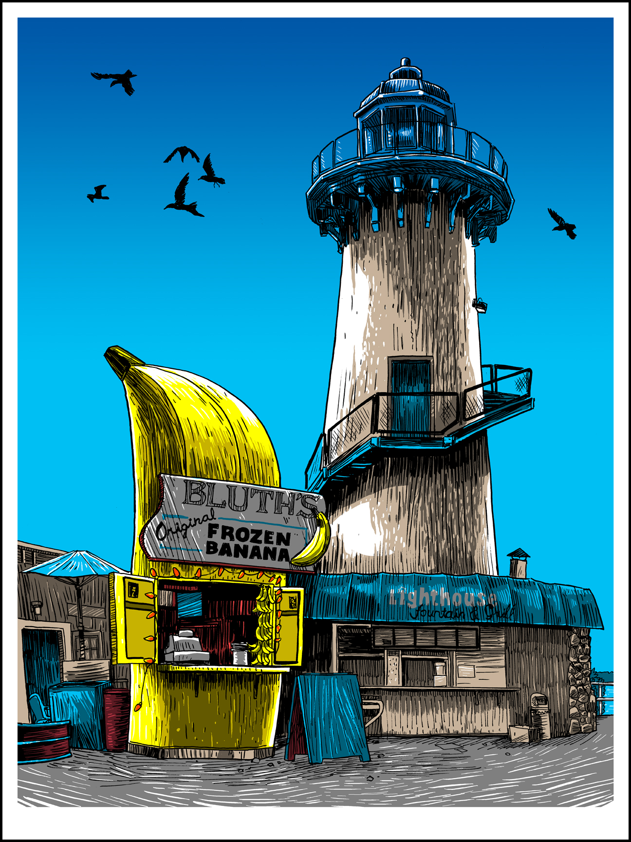
“10 cents gets you nuts”
18×24 signed and numbered edition of 100.
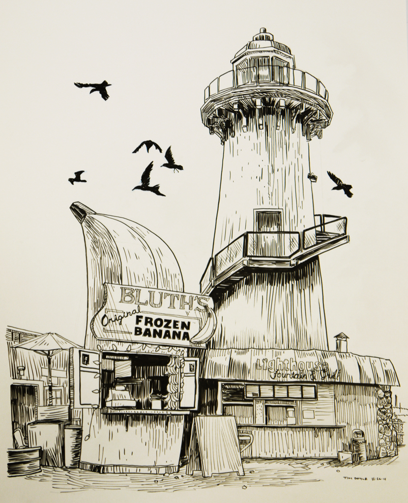
Next up, I went a little bit more contemporary with the Bluth Banana stand. This show wormed it’s way into me post-cancellation, I’m embarrassed to say. But I’d guess that’s the case with the vast majority of AD‘s fans today. As I was working on this print, the news broke that Arrested Development was in fact coming BACK to television, albeit through the subscription service Netflix, and later into theaters in a long-rumored film. This is fantastic news- and what I believe is a first for network TV- the internet spoke as a collective and WILLED this show back into production. This isn’t the case of some stiff in a suit saying “You know what was popular? 90210. Let’s do that again, even though no-one ever asked for it.” The only reason Dallas is back on the air is because people recognize it as a BRAND, not as a show anyone was dying for more of. But this is something…else. We weren’t done with the Bluths, and we demanded a family reunion. And we’re getting it. Now, who wants to start a Kickstarter to get Firefly back? The internet has spoken.
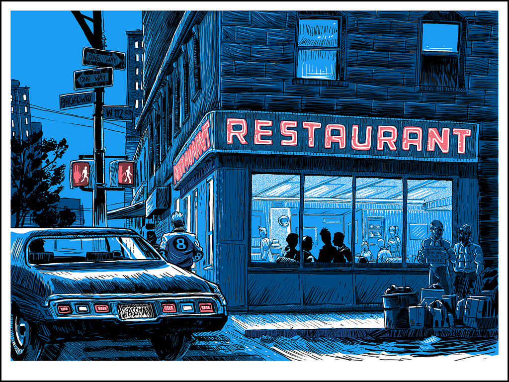
“The Big Salad”
18×24, signed and numbered edition of 100.
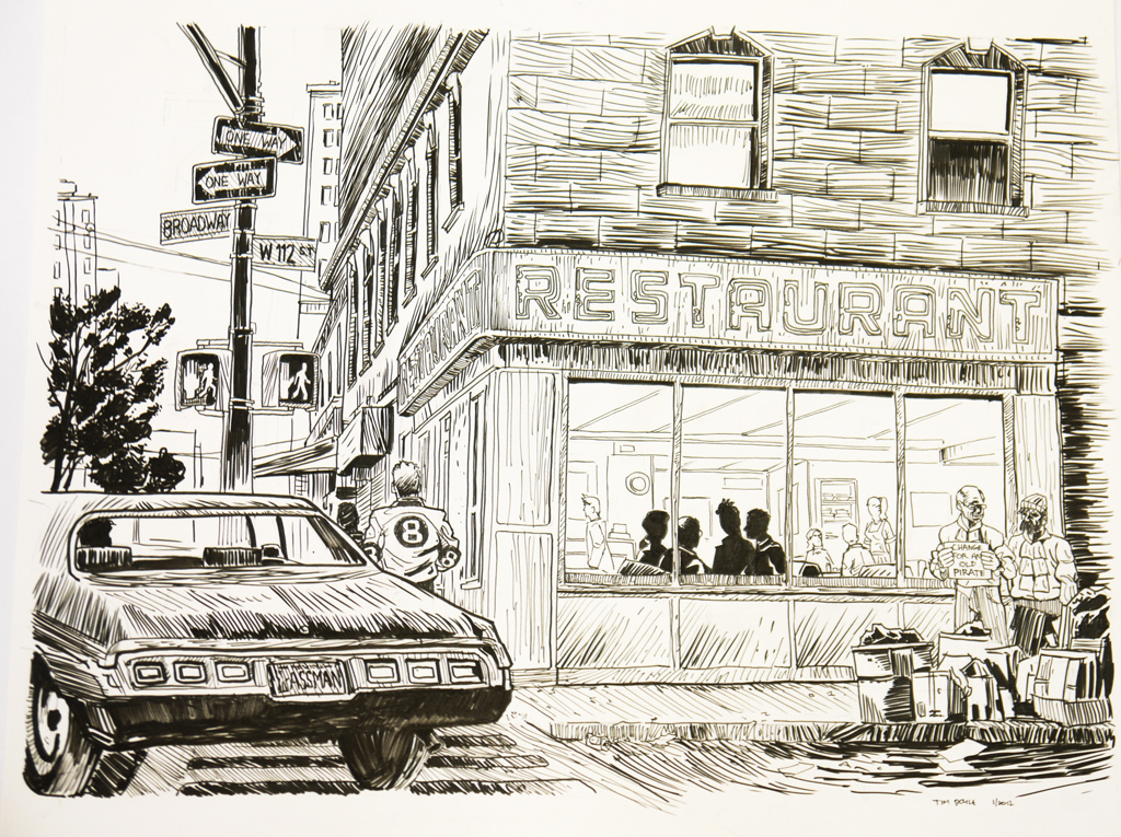
I don’t think there’s been a show as socially changing as Seinfeld, at least not for my generation. It had a cultural ubiquity that hasn’t been found since. The diversification of media and the multiplication of viewing options that cable afforded after this show took it’s bow pretty much guaranteed that. I believe it was truly the last great hurrah of the network comedy. I’m reminded of a quote from Alec Baldwin’s Jack character from 30Rock, where the show’s version of NBC’s business strategy was to “make it 1997 again through science or magic.” That ship has sailed, though- for if there was any justice in the world, Curb Your Enthusiasm would be just as popular as Seinfeld ever was. Seinfeld’s crowning achievement, I think, was to bring neurotic, New York Jewish comedy to middle America- something that not even the great Woody Allen was able to. It was a sit-com that injected stand-up culture into the living room in a way that Carson and Letterman couldn’t. Seinfeld was a comedy about the small things, waiting in line, ordering soup, licking an envelope- the narrative stuff that stand-up is made of. I would say the brilliant Louis C.K.’s Louie is Seinfeld’s direct descendant, with it’s seemingly free-form episode structure and stand-up framing device. While Seinfeld’s main competitor in the show’s early years was the overly sentimental and catch-phrase heavy Tim Allen vehicle, Home Improvement- in a few seasons Seinfeld would become a dominant cultural force and Home Improvement merely a footnote. The show made meanness funny, and all other shows seem tame in comparison. The ‘cool’ kids watched Seinfeld. The normal kids watched banal crap like Full House and Perfect Strangers. (I have to admit to watching both shows in my youth.) My group of friends was glued to Seinfeld every week, and it was all we talked about over lunch in the school cafeteria the following day. I don’t know how many inane conversations I had to endure of people trying to force a group of friends into the roles of the principals on the show. Consensus always made me come out as George- but at least no-one in my group was trying to figure out who was Chandler and who was Monica. I would have murdered everyone involved in that discussion. Even the language of the show entered common usage like a virus- if I say “Master of my Domain” you know what I’m talking about, regardless of whether you’ve see that episode or not. I could go on endlessly about the show, but this is an article about an art show about television. So-
For a show based almost completely around interior locales, there is one stand-out exterior shot in Seinfeld- the restaurant. Unlike the other prints in this series, the restaurant is an actual location you can visit and touch- reality and fiction intertwined. While the diner is called ‘Monks’ in the show, it is in fact Tom’s Diner (of the Susanne Vega song) on 2880 Broadway in New York. Fun fact I learned while researching this print is that the exterior of the actual diner in no way matches up with the set that was built in LA.
“Unreal Estate” opens up on February 2nd at the Spoke Art gallery on 816 Sutter St in San Francisco. Prints unsold at the opening will be available online the day after.
Thank you for reading this admittedly rambling run-down of the show.
-Tim Doyle
Here are some sketches/detail images of the same select sample images featured above…
[click images to enlarge]
