Product Placement – Group Show @ Gallery 1988 [LA]
screenprint group show advertising products that only exist in TV shows and movies feat. work from over 3 dozen different artists, all with limited edition pieces.
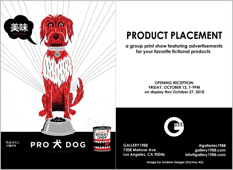
“Doggy Chop”
3 color screenprint
18 x 24 inches
signed and numbered,
limited edition of 40
There was a moment in my tweenage years where the value of design clearly came into focus for me. I can’t remember exactly how old I was, although I believe that it must have been early junior high. What I do remember, however, is sitting at a kitchen table and picking up a product of some sort, appreciating the packaging, and thinking about how someone had designed and created it. It could have been a can. It was, most likely, a box. I’d already givien a decent amount of consideration to the idea of boundaries and to what defined “art,” by that point, just like I have continued to do over the 20-some-odd years, which have since followed, and now I was looking toward the items that I saw everyday for further understanding — the objects which subtly infiltrated my life on a day-to-day basis, more than likely affecting it in some way, yet operated as inconspicuous components forming the background of my very environment. I was recognizing them for the energy poured into carefully designed aesthetics, crafted to make me feel one way or another about what I was holding in my hands, and/or how it was meant to make me feel one way or another about myself. After all, the Mona Lisa was as much of a logo/brand/product as a box of Corn Pops, by this time in history, and was definitely featured on a hell of a lot more souvenirs, products, and clothing. The internet wasn’t really blowing up yet, “top 10” lists and clickbait weren’t swallowing up and derailing our focuses, so architectural and product “design” wasn’t really at the forefront of most people’s minds unless you were working in, studying, or focused on advertising or the visual arts in some capacity, already. The idea that one thing was “art” and that something else wasn’t, just didn’t ring true to me and it still doesn’t. What might be odd is that, prior to a quick, yet prominent, reference in the film Wayne’s World, I hadn’t really considered the idea of product placement in entertainment media and how particular products would be placed within such things as film and television to hit us — subliminally, or otherwise — with messages to purchase their garbage, while we were sufficiently hypnotized by the action and storylines.
We’ve been going back and watching the old “classics” with my first grader, as of late, and not everything is quite as I remember, while other films like ET, have proven to be een more powerful and timeless. One of the motion pictures that we’ve revisited recently was Back To The Future II, a film that I always viewed as, quite possibly, the best of the trilogy and, only now, realize is, more likely than not, the absolute fucking worst. For those that haven’t seen it in decades, as I hadn’t, I can summarize it fairly quickly by stating that, aside from the various inconsistencies in logic throughout the pothole-riddled storyline, and the mediocre acting, the sequel, essentially, forces the viewer to re-watch the first film all over again, as Marty McFly retraces his own footsteps in a film that is already based on revisiting the past. It became clear to me that the real appeal of Back To The Future II lies within its speculations about the future — a time which, as I type this, would have already come and gone 3 years ago, according to the script. The product placement in the first film was impressive at points, with the mention of a Pepsi being integrated smoothly enough that it was more than just an ad for a soft drink, it was used as a moment to demonstrate how our protagonist was a man out of time experiencing conflict, while attempting to adjust to the environment that he’d been thrust into. In part 2, it often felt even more haphazardly packed with advertising spots by even more corporations looking to cash in after the tremendous success of the initial film. But it was the fake products like the hoverboard, and the self-tightening NIKE Air Mags that, not only had people returning to the theater in droves those 30-plus years ago, but has kept them discussing it and, even using it as a measure of our progress as a society. Example: “It’s 2018, where are our hoverboards!!!”
Five years ago, Los Angeles‘s pre-eminent pop-culture themed art space, Gallery 1988, hosted a group exhibit titled Product Placement, dedicated to showcasing “screenprints of your favorite products that don’t exist.” We posted a preview for it, then, excited to witness the respective interpretation on these fake Hollywood products by a variety of international visual artists. Just last night, G1988 hosted the opening reception of their latest installment of Product Placement providing a platform, yet again, for “artwork inspired by fictitious items from movies & TV” and, to be entirely honest, this very well might be better than that first one. What I like about this show is how it allows the artist to pay tribute to nostalgic content that has stuck with them from the entertainment world and, in turn, incorporate related references, while simultaneously taking the reigns to play advertising wiz on their own terms. In short, it’s just a fun exhibit to view, as it has to be an enjoyable one to contribute to. The show runs until October 28th and, as usual, we recommend checking this thing out in person, if you have the opportunity.
Check out a selection of images for the exhibit below the following event details…
WHAT:
“Product Placement”
artwork inspired by fictitious items from movies & TV
WHEN:
Opening reception:
Friday, October 12th
7pm-9pm
On display through October 27th, 2018
WHERE:
Gallery 1988
7308 Melrose Ave.
Los Angeles, Ca 90046
(323) 937-7088
ADDITIONAL INFO:
Opening is ALL AGES w/NO COVER
Several artists will be in attendance
Exhibit will be on view until October 27th, 2018.
The gallery is open from 11 – 6pm from Wednesday – Sunday.
email: [email protected]
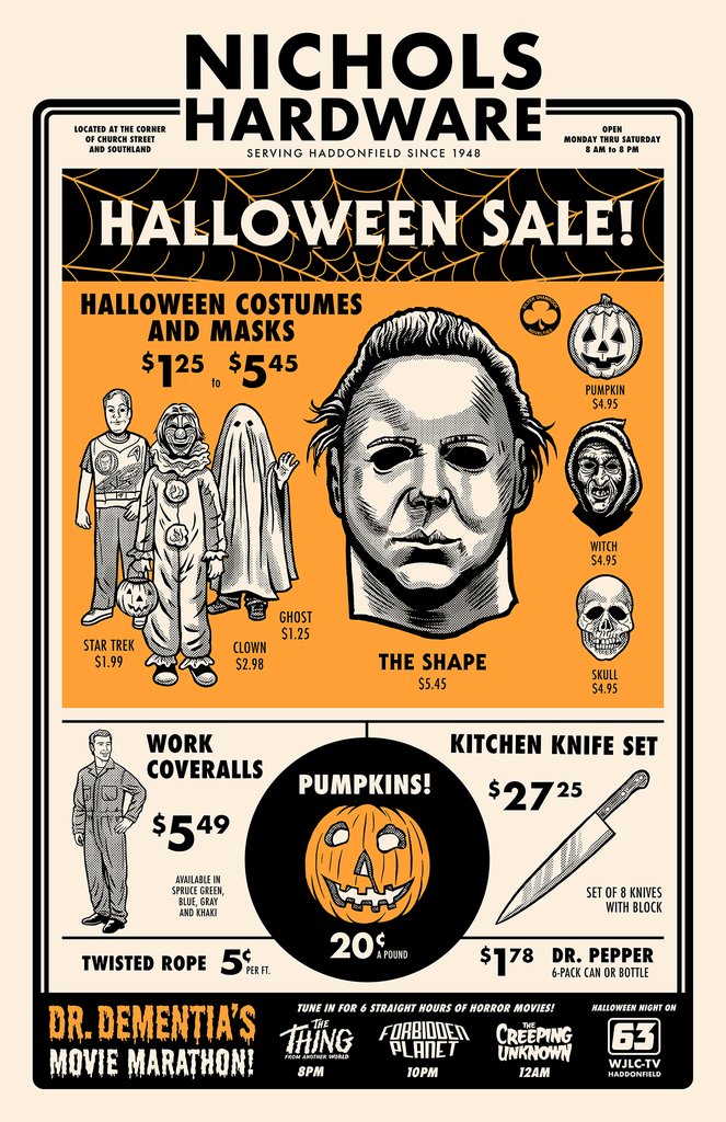
“Nichols Hardware’s Halloween Sale”
2 color screenprint on Cougar Natural Paper
11 x 17 inches
signed and numbered,
limited edition of 75
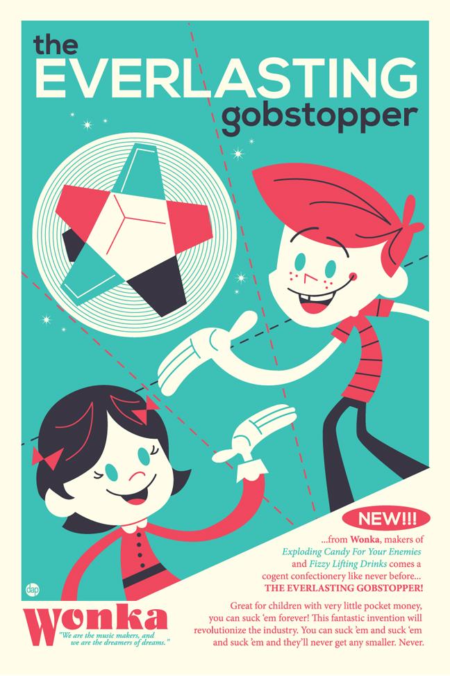
“For Children with Very Little Pocket Money”
2 color screenprint on Cougar Natural Paper
12 x 18 inches
signed and numbered,
limited edition of 35
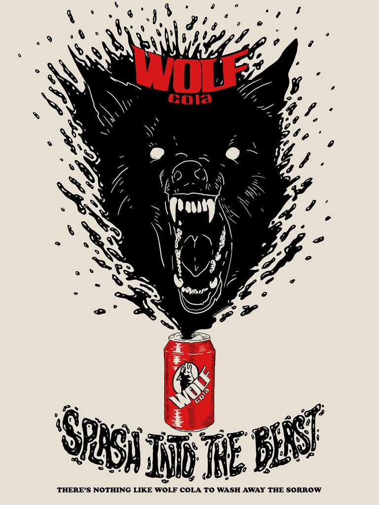
“Wolf Cola”
2 color screenprint on Speckletone French Paper
18 x 24 inches
signed and numbered,
limited edition of 35
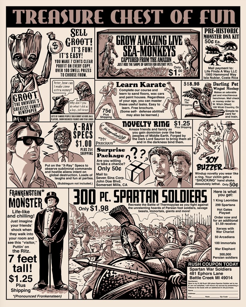
“Treasure Chest of Fun”
2 color screenprint
16 x 20 inches
signed and numbered,
limited edition of 30

“What Plants Crave!”
4 color screenprint with glow-in-the-dark ink on 100lb Lemon Yellow Poptone French paper
18 x 24 inches
signed and numbered,
limited edition of 35
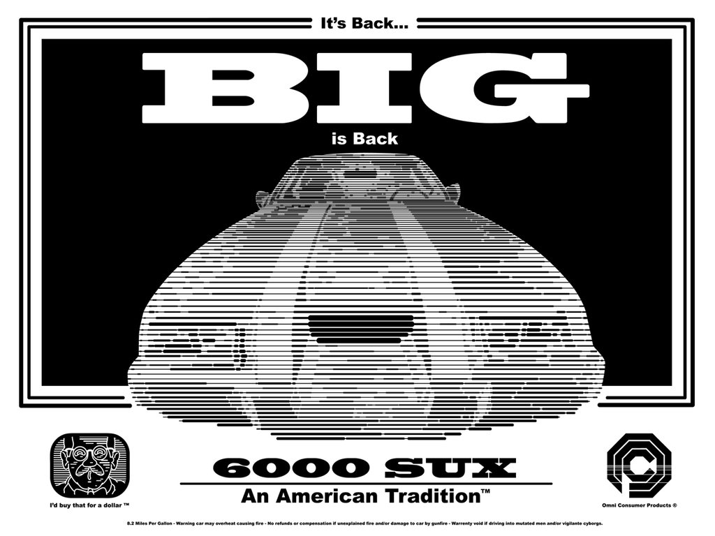
“6000 SUX”
1 color screenprint
18 x 24 inches
numbered,
limited edition of 50
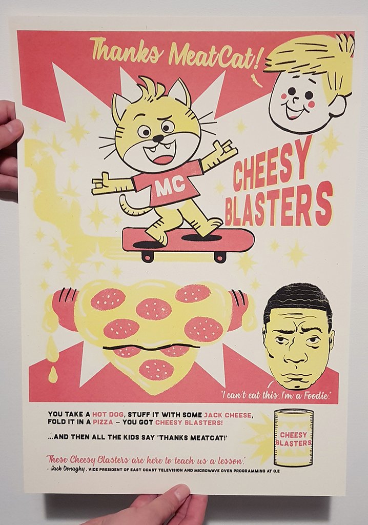
“Cheesy Blasters”
3 color Risograph using soy based ink on recycled speckled Context Birch 170gsm paper
11.7 x 16.5 inches
signed and numbered,
limited edition of 45
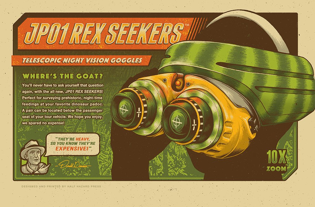
“Where’s The Goat?”
6 color screenprint
12 x 18 inches
signed and numbered,
limited edition of 100
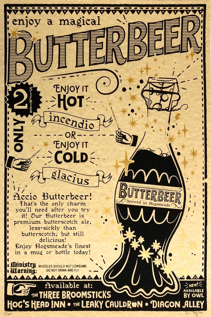
“Less-Sickly than Butterscotch”
2 color screenprint with metallic gold ink
12 x 18 inches
signed and numbered,
limited edition of 65
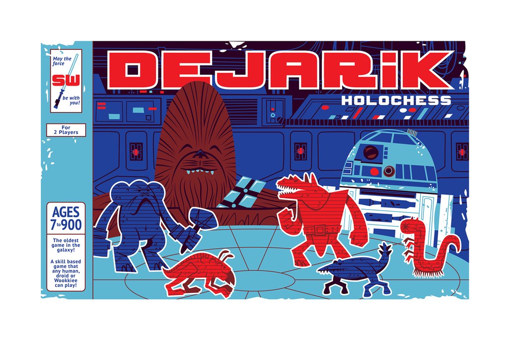
“Dejarik: Holochess”
3 color hand pulled screenprint
18 x 12 inches
signed and numbered,
limited edition of 35
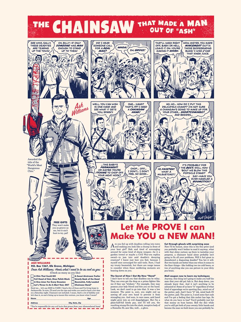
“The Chainsaw That Made a Man out of Ash!”
2 color screenprint on French Construction Whitewash paper
18 x 24 inches
numbered,
limited edition of 40